In Excel, it is possible to create a quick and effective visual that offers more flexibility than a traditional chart. With a clever combination of symbols, the REPT function, and a little formatting magic, you can build compact in-cell bar charts that are dynamic and informative.
In this article, we will create a bar chart inside a cell, colour it based on custom performance thresholds and add values as data labels.
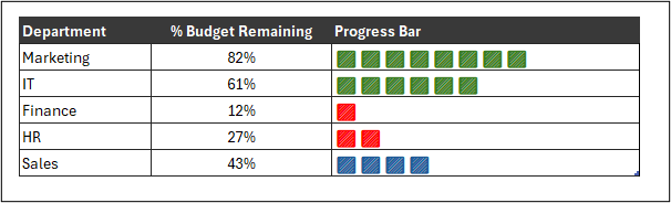
Let’s create the following dynamic bar chart without relying on standard chart tools.
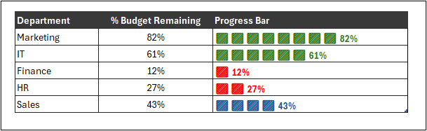
Create the In-Cell Bars
To begin, we will create the in-cell bars using the REPT function in Excel along with symbols or emojis.
What does the REPT function do?
The Excel REPT function repeats text (usually a single character or symbol) a given number of times.
This makes the function ideal for creating slick progress bars from any characters we want and can apply custom formatting to them.
The REPT function syntax requires just the text and the number of times to repeat it.
=REPT(text, number of times)
The Formula for the Bar Chart
The following formula can be used in the Progress Bar column of the table. And yes, the data is formatted as a true Excel table so we see the structured reference to the % Budget Remaining column rather than a reference to range C3.
=REPT("🟩",[@[% Budget Remaining]]*10)
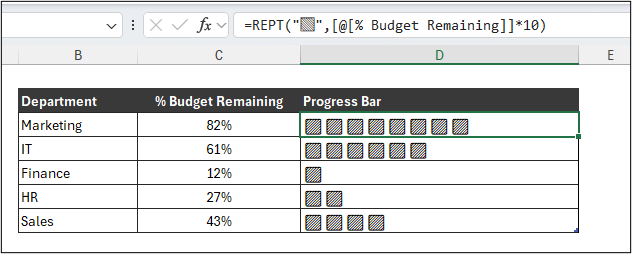
For this in-cell bar chart, a formula was used to calculate the number of times the square symbol is to be repeated. Due to the budget remaining being a percentage value, it was multiplied by 10, so .82 would become 8.2.
The ROUND function could have been used to round the result to an integer, but it was not required for this example to work.
To insert the square symbol into the formula, the emoji keyboard was used.
To open the emoji keyboard, simply press the Windows & period “.” keys on the keyboard. You can then search for any emoji you want, in this case, the square.
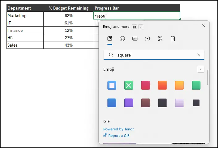
The emoji must be insert as a text string, so within the double quotation marks.
Adding Conditional Formatting to the Bars
We will now add Conditional Formatting to the bars so that they automatically change colour dependent upon the budget remaining.
Let’s work with these threshold values.
- Green > 60%
- Blue 30-60%
- Red < 30%
Select the bars in the Progress Bar column, and click Home > Conditional Formatting > New Rule > Use a formula to determine which cells to format.
In the box provided, type the following formula to test if the % budget remaining is greater than 60%.
=C3>0.6
Range C3 is the first cell in the % Budget Remaining column. This rule will be automatically applied to all other cells in that column.
Click Format and choose the formatting you want to apply to the bars. In this case, I will apply a green font colour and set them to Bold.
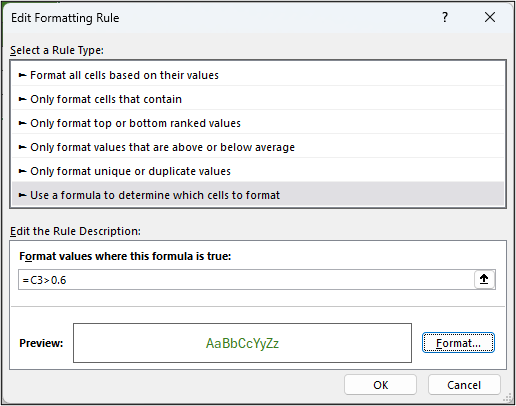
We can then repeat the steps for the other thresholds.
For the less then 30% rule, the following formula can be used in a Conditional Formatting rule.
=C3<0.3
And for the between 30% and 60% rule, the following formula can be used.
=AND(C3>=0.3, C3<=0.6)
The AND function was used for this rule to ensure that both conditions were met. The budget remaining is both greater than or equal to 30% and less than or equal to 60%.
Our custom in-cell bar graph is now really taking shape. Next, we will add data labels to the end of each bar.
Using the TEXT Function for Data Labels
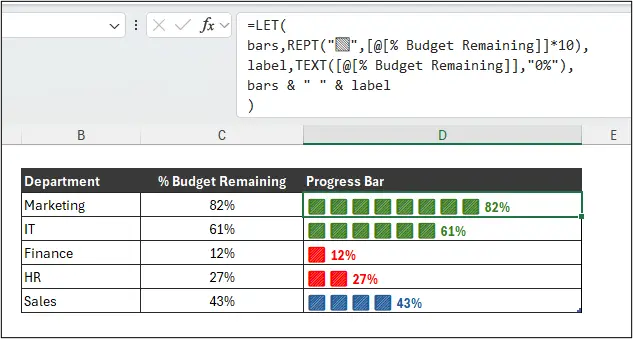
The final touch to our custom bar chart is to add data labels to the end of each bar.
This is simply a case of concatenating the value from the % Budget Remaining column (or any value we wanted) to the end of what REPT returns.
However, to format the numeric value accurately, so to a percentage and to zero decimal places, we will need the TEXT function. This function converts numbers to text but enables us to format them how we like.
The following formula can be used.
=REPT("🟩", [@[% Budget Remaining]]*10) & " " & TEXT([@[% Budget Remaining]], "0%")
Using LET to Tidy Up the Formula
However, in modern Excel, this is a scenario where it would make sense to use the LET function to organise the parts of our formula more clearly.
The REPT and TEXT function results can be assigned to names, such as bars and labels. Then these names can be used in a final calculation. It may seem like more, and it is, but the formula is more digestible and easier to troubleshoot.
=LET(
bars, REPT("🟩",[@[% Budget Remaining]]*10),
label, TEXT([@[% Budget Remaining]],"0%"),
bars & " " & label
)
The formula could even be saved as a custom LAMBDA formula to be utilised again and again in the future. Of course, the Conditional Formatting rules would still require repeating.
One of the joys in using Microsoft Excel is the level of creativity it can bring. There is no one way of creating a report and data visualisation is not exempt from that.
Now, go create your own awesome custom data bars.



Leave a Reply