• Skip to main content
  • Skip to primary sidebar
  • Skip to footer

Microsoft Excel Tips and Tricks - Computergaga

  • Home
  • Excel Online Courses
  • Excel Functions List
  • Free Downloads
  • Blog
  • Tutorials
  • About
Home / Archives for Charts

Advanced Excel Skills

Excel is an extremely powerful program used by businesses all over the world. Users with advanced Excel skills are in huge demand.

If you are wondering “how to improve my Excel skills?”, you are in the right place. The list below is a collection of advanced Excel tips to enhance Excel skills and make you an Excel superhero.

Advanced Excel Formulas

If you asked someone, what are advanced Excel skills? You can be sure that advanced Excel formulas would be a common response.

Formulas are what drive an Excel spreadsheet. Formulas provide the muscle for a spreadsheet to analyse, manipulate, convert and look up data with incredible speed and power.

An advanced Excel user would need advanced formula skills. They would have a commonly used list of functions that they know well, but also the skills and confidence to adapt to any situation requiring formulas.

Ultimate VLOOKUP function guide

5 examples of the groovy SUMPRODUCT function

The INDIRECT function – 5 great examples

4 alternatives to nested IF formulas

List of Excel functions

Learn more advanced Excel formulas

[Read more…] about Advanced Excel Skills
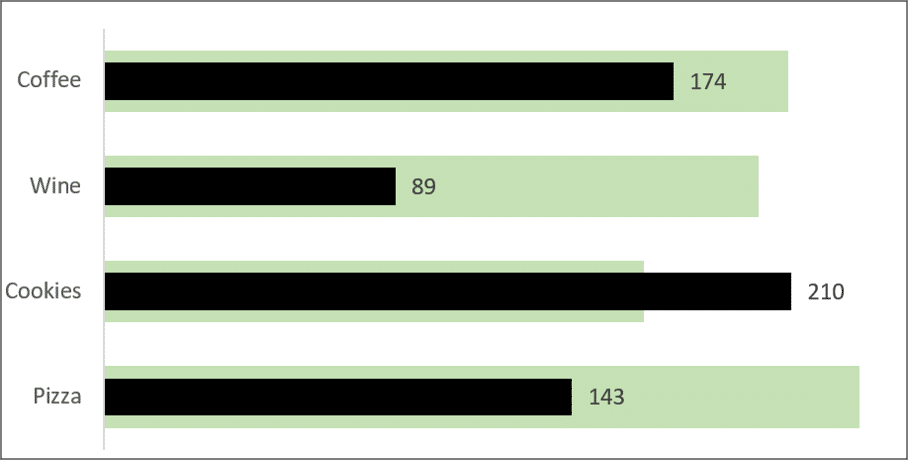
Bar in Bar Chart to Compare Actuals Against Target Values

A bar in bar chart is a great way to compare two values such as actuals against target, this week v’s last week, or progress toward a goal.

In this blog post, we will demonstrate two different ways to create a bar in bar chart like the one below. This shows the actual values (black) against the target values (green) very neatly and clearly.

Bar in bar chart in Excel
[Read more…] about Bar in Bar Chart to Compare Actuals Against Target Values

Create a Line Graph with a Target Range

Create a line graph with a target range to easily visualise values that are achieving a performance expected of them.
The great news is that this is very simple to add to your line graphs, yet extremely effective.

You can read on to see the steps or watch the video of the process.

[Read more…] about Create a Line Graph with a Target Range

Excel Doughnut Chart to Measure Progress to a Goal

An Excel Doughnut chart is a very popular way to measure progress towards a goal or target. They are simple to understand, appealing to the eye and familiar to users.

You see Doughnut charts being used to show progress in the news, in business reports and even when your computer is loading or refreshing.

Well the good news is that they are also extremely easy to create.

Watch the Video

[Read more…] about Excel Doughnut Chart to Measure Progress to a Goal

Conditional Formatting with Charts in Excel – Two Examples

You may already be familiar with the Conditional Formatting tool in Excel. The amazing tool that automatically formats values tat meet specific criteria and improves how we visualise our data. Unfortunately, there is no Conditional Formatting with charts in Excel.

However, there is a way to create a Conditional Formatting with charts effect in Excel. And the great news. It is not that difficult. A simple IF function or other to perform a test and produce the required value for the chart is all we need.

This blog post will look at two examples of Conditional Formatting with charts so that you get a feel for how to do it. You can then apply the same technique to whatever example you need.

Highlight a Column Based on User Selection

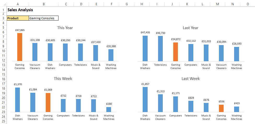
In the first example shown in the image below. We want to be able to highlight the column in each chart that corresponds to the product type selected by the user in cell B3.

Conditional Formatting with charts in Excel to highlight a selected value

To achieve this we first need to add a column to the table which will show the value if the product type is selected by the user, but show the #N/A error if it is not.

The IF function is used to perform this logical test and required actions. The NA() function is used to return the #N/A error if it is not the product type selected. This is done because the chart will not plot error values, so it essentially hides those values on the chart.

The formula below is the one entered into cell C4. It compares the product name against the one selected by the user in B3 of the Sales By Product worksheet. It then displays the value in cell B4 if it is a match, or shows the error value if not.

[Read more…] about Conditional Formatting with Charts in Excel – Two Examples
  • Page 1
  • Page 2
  • Page 3
  • Go to Next Page »

Primary Sidebar

Recent Posts

  • Excel SWITCH Function – Nested IF Function Alternative
  • Sum Formulas Only in Excel
  • How to Calculate Age in Excel
  • Custom Sort in Excel
  • Case Sensitive Lookup with XLOOKUP in Excel
Advanced Excel Success book

Footer

Contact

[email protected]

LinkedIn Twitter YouTube

Useful Links

  • Home
  • Excel Online Courses
  • Tutorials
  • Sitemap
  • Privacy Policy
  • Jobs by Jooble

Course Topics

  • Blog
  • Charts
  • Courses
  • Dashboards
  • Downloads
  • Excel Tips
  • Formulas
  • Mail Merge
  • Office
  • PivotTables
  • Power BI
  • Power Pivot
  • Power Query
  • VBA

Join Our Mailing List

© Copyright 2009 Computergaga · All Rights Reserved ·