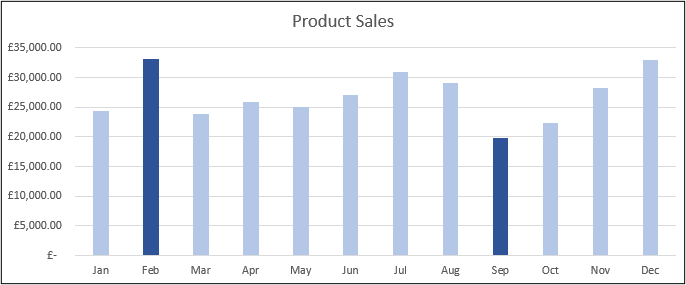
When using column charts to compare values, you may want to highlight the max and min values on the chart. By highlighting the maximum and minimum values, it removes any confusion identifying the top and bottom values.
Finding the Max and Min Values
To show the max and min values on a column chart, we will first need to identify the max and min values of our range. These values will then be used as a second data series when we create the column chart.
We will use the following formula to check the values in our range, and return the value if it is the maximum or minimum. Otherwise the NA() function is used to return the #N/A error. We want this because the chart will not plot these error values.
=IF(OR(B4=MAX($B$4:$B$15),B3=MIN($B$4:$B$15)),B4,NA())
The range of cells we will use to create the column chart will look like below.
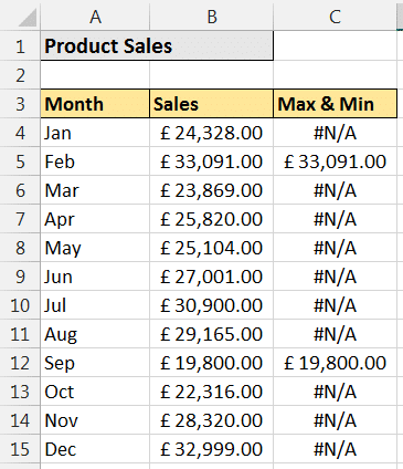
The formula uses the IF and OR functions. The OR function enables us to test if the value is either the maximum or minimum figure. The IF function then takes the required action, which is to either display the value or return #N/A.
Creating the Column Chart with Highlighted Max and Min Values
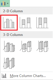
Select the range of cells to chart. In this example, that is A3:C14. Then click Insert > Column Chart and select the 2D Clustered Column (This is the first chart in the sub-type list).
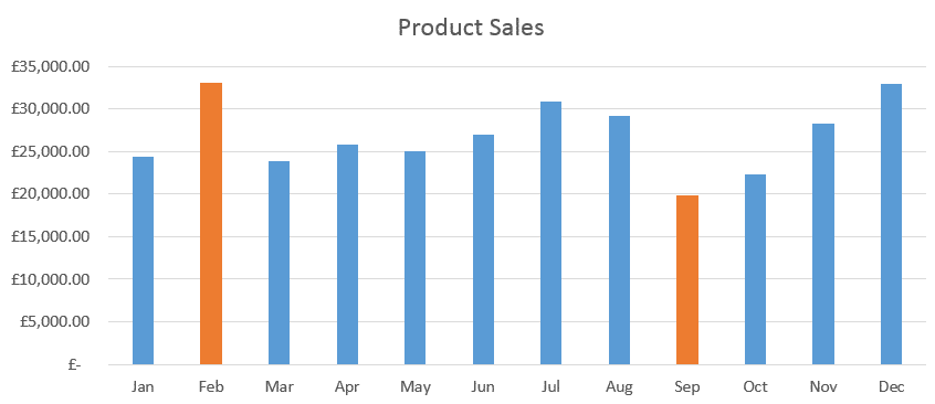
The chart will appear like in the image below. The two data series are shown as separate columns.
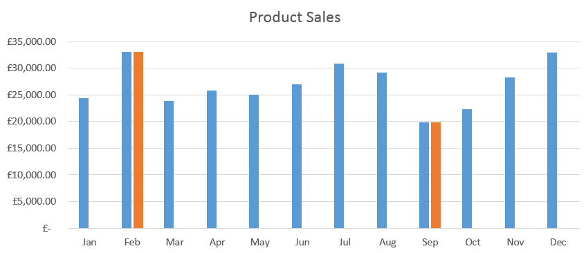
We want to highlight the max and min values on a column chart with it appearing as one data series. So, let’s overlap the two data series.
Click on one of the columns in the chart. Click the Format tab on the Ribbon and the Format Selection button. Enter 100% in the Series Overlap field.
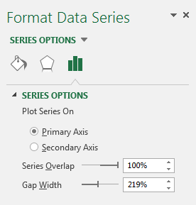
The two data series are now overlapped giving the appearance of one data series with the max and min values highlighted.
You can apply further formatting to adapt the chart to your own needs.


Great Site people. I’m becoming the go to guy at the office. Keep the videos and courses coming.
Great to hear. Thanks Teekay.
Great tip!
I think it should be
IF(OR(B4=MAX($B$4:$B$15),B4=MIN($B$4:$B$15)),B4,NA())
thanks sangat membantu untuk dipelajari..,