Create a Histogram in Excel to graphically represent the distribution of data. It looks like a column chart with each column representing an interval (bin), and the column height representing the frequency that it appears.
Essentially the graph groups numbers into intervals (bins) and displays how often they appear. The graph then beautifully illustrates how the sets of numbers are distributed.
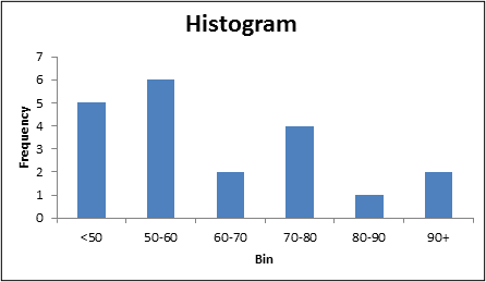
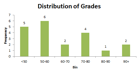
For example, the histogram below displays the distribution of school grades from 20 pupils among different intervals.
Create a Histogram in Excel
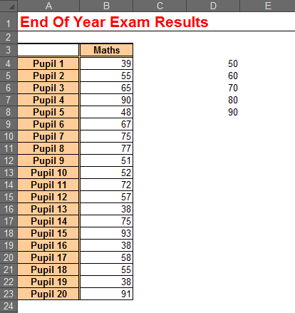
- To create a histogram in Excel, you first need to enter the bin values (interval ranges) that you want to use. This will be the upper value of the interval e.g. for 60-70, enter 70.
Bin values have been entered in the range D4:D8 in the example below.
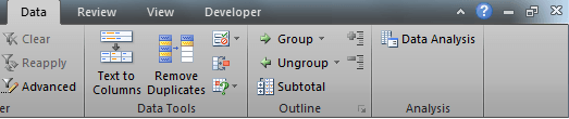
- Click the Data tab, and then the Data Analysis button
If you cannot see the Data Analysis button, then the Analysis Toolpak has not been installed.
Click the Add-Ins button on the Developer tab, check the Analysis Toolpak button and click OK to install it (Having trouble? Watch this video on how to install the Analysis Toolpak add-in).
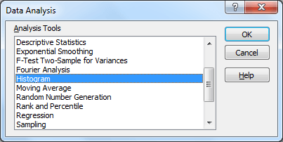
- Select the Histogram tool and click OK.
- For the Input Range, select the range of cells containing the data that you want to chart. In this example that is the school grades in B4:B23.
- For the Bin Range, select the interval values entered in step 1. In this example that is D4:D8.
- In the Output Range box, enter the cell that you want to display the frequency distribution table that will be created by the histogram tool.
- Select the Chart Output option.
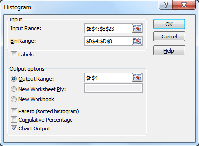
- Click OK. The result will be something like the image below.
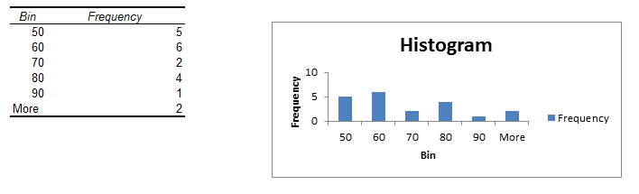
- When you create a histogram in Excel, the initial output might not be exactly what you want. For the last steps I will make a few minor changes to improve the look of the histogram.
Click on the Legend and press Delete. As there is only one data series the Legend does not have a purpose.
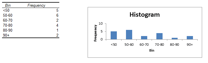
- Edit the bin labels in the outputted frequency distribution table to something more meaningful.
- The last steps will be to resize the chart, edit the chart title and maybe apply some finishing touches such as changing the column colours and applying data labels.
Watch the Video
Other tutorials you might be interested in
The STDEV Function in Excel – The STDEV function or standard deviation function is used to show how widely spread your data is from a central point, the mean or average. It is one of the Excel statistical functions.
About Histograms – An explanation of histograms including exercises from the team at Maths Is Fun.
The COUNTIFS Function – This function is used in Excel to count all the cells within a given range that meet multiple conditions.


Very good will try and use it for my church project