When creating reports in Excel, a common requirement is to report on a rolling basis. For example, this could mean the last 12 months, the last 6 weeks or the last 7 days. In this tutorial, we create a rolling chart in Excel to produce a report like this.
Whatever the timeframe being reported, this can mean a lot of time editing chart sources and formulas to show the right data.
This blog post looks at creating a dynamic rolling chart in Excel to show the last 6 months of data, so when new data is added to the table, the chart automatically updates to report the last 6 rows (months).
To create a rolling chart, we will first create two dynamic named ranges. These will automatically capture the last 6 months data. One named range for the chart data, and the other for its labels. We will then use these named names for our chart source.
Creating the Dynamic Named Ranges
The OFFSET function will be used to make the named ranges dynamic. This function enables you to reference ranges, relative to another range of a sheet. So this can be used to capture the last 6 rows.
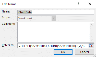
Let’s first create the chart data named range.
- Click the Formulas tab of the Ribbon and then the Define Name button.
- Enter a name for the defined name. You can use whatever name you wish. I have called this one ChartData.
- In the Refers to area, enter the formula below. The different parts of this formula can be edited to meet your needs.
This formula starts from cell B1. It then moves to the bottom of the column. The column bottom is found by counting how many values in column B. The -6 and 1 on the end of the formula are used to return the last 6 rows and 1 column from that cell.
=OFFSET(Sheet1!$B$1,COUNT(Sheet1!$B:$B),0,-6,1)
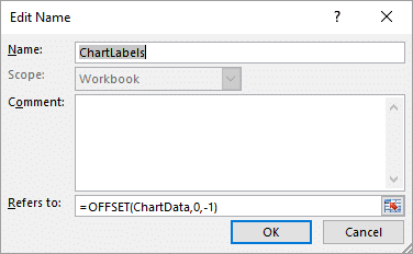
We now need to create another dynamic named range for the chart labels. The OFFSET function below will be used.
This function uses the previous defined name and selects a range of equal height that is one column to the left. In this example, that is column A.
=OFFSET(ChartData,0,-1)
Editing the Charts Data Source to use the Dynamic Ranges
The chart new needs to be edited to use the named ranges for its data and its labels.
- Click the Design tab under Chart Tools on the Ribbon.
- Click the Select Data button.
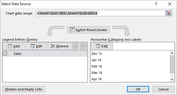
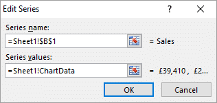
- Click the Edit button from the Series section on the left.
- Cell B1 has been selected for the Series name. This uses the Sales header for the name of the data series (in this example that is kind of redundant as I only have one series, but you may have more).
- For Series Values, the ChartData named range has been entered. Be sure to keep the sheet name in there too like in the image below.
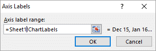
- Click Ok, and then click the Edit button for the Labels section on the right.
- In the Axis label range area, the ChartLabels named range has been entered. Once again be sure to keep the sheet name in the reference. And click Ok.
The dynamic rolling chart in Excel is created. If you add more rows to the table, the chart automatically updates to show the last 6 months.
Watch the Video – Rolling Chart in Excel
More Awesome Excel Chart Tutorials
Highlight the max and min values of a column chart
Create a scrollable chart for your Excel dashboards
Create a Waterfall chart in Excel
Add drop lines to your line graph


How could you do something similar for a rolling this week v last week ?
Thanks
Hi Andrew,
You could absolutely create the same effect. You would layout you data in a similar way for each week and in a row, or column, and then create the same functionality. If you are comparing this week v last week you would probably want a column to calculate the variance also and add to the chart.
The same skills taught in the video apply whether it be months, weeks, days or years.
I use a similar OFFSET formula but when the amount of cells containing data is less than the Offset amount, it throws my chart off. For example, in your chart above, if you only have 4 months worth of data, your Offset will still try to reference 6 rows… so it will end up referencing your column title and then produce an error because it runs out of rows.
Is there a way to avoid this? Maybe some kind of parameter that tells it to stop at a specified row, or mixing in an IF, THEN formula?
Thanks!!
Absolutely an IF function can be used to test and take action against this scenario. I used the following formula in the ChartData named range to combat this.
=if(counta(Sheet1!$A:$A)<6,OFFSET(Sheet1!$B$1,COUNT(Sheet1!$B:$B),0,,1),OFFSET(Sheet1!$B$1,COUNT(Sheet1!$B:$B),0,-6,1))
This runs an alternative OFFSET function depending on whether there are 6 rows or not.
In cell B3 of the sheet I used the following formula. This is referenced in the first OFFSET function to see how many rows to chart, if there are not 6+.
=COUNT(A:A)*-1
Hope this helps.
Alan
Awesome! I came up a MIN/MAX and COUNTA version that did the job. Thanks:)
Hi Alan,
Why might the Edit buttons be greyed out when I go to change the Series values under Select Data please?
Sorry Steve, I’m not sure. I just tried having a look and I could not create that problem.
I’ve created a moving chart using the formula formats provided above. I am having a problem where some of the charts will plot two rows that do not contain any data. The two blank rows are at the bottom of my data, so they’re not contained within the rows that actually have data. I have data in rows 6 through 342, but the chart is pulling in blank rows 343 and 344. Thank you.