PivotTables are one of the most useful tools in Excel. They allow you to easily summarise, examine and present a complex list of data.
This blog post explores 5 advanced PivotTable techniques.
- Grouping fields by month and year
- Calculating data as a percentage of the total
- Using Slicers
- Applying Conditional Formatting to PivotTable data
- Creating calculated fields
If you are new to PivotTables, check out our introduction to PivotTables tutorial.
Grouping Fields by Month and Year
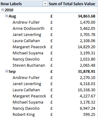
You can group any numerical field in a PivotTable. A common reason to do this is to group date and time fields. For example, to group by week, hour or as I will demonstrate in this tip by month and year.
- Move the Date field you want to group by to the desired area of the PivotTable.
- Right mouse click on a cell in the PivotTable that contains a date and select Group.
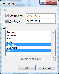
- Select the Months and Years fields and click Ok.
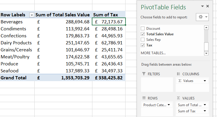
Calculating Data as a Percentage of the Total
Fields that are added to the Values area of a PivotTable are automatically summed. You can change the function being applied, but what you may not know is that you can also change the calculation type for a data field.
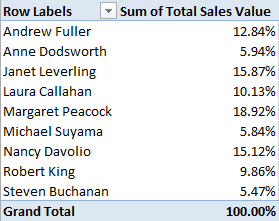
A common example of doing this would be to calculate the data as a percentage of the total. So you could view the sales by a sales rep as a percentage of the total sales.
- Right mouse click on one of the values in the table and select Value Field Settings from the shortcut menu.
- Click the Show Values As tab.
- Click on the list arrow and select % of Column Total.
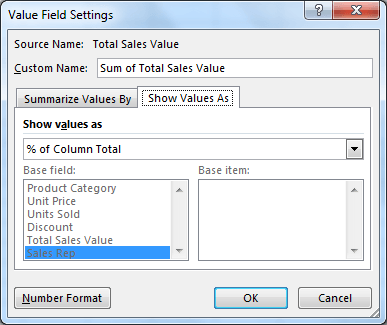
- The values are changed to show the sales as a percentage of the total.
Using Slicers
Slicers were introduced in Excel 2010. They provide a nice visual way of applying filters to PivotTables.
Their greatest benefit is that they can be connected to multiple PivotTables. To filter multiple PivotTables at the click of a button is a fantastic skill for reporting dashboards.
- Click the Analyze tab under PivotTable Tools on the Ribbon (this tab is called Options in Excel 2010).
- Click the Insert Slicer button.
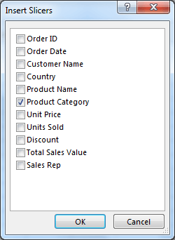
- Select a field to use for the slicer and click Ok.
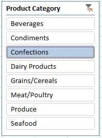
- You can now filter the PivotTable by clicking on one of the options in the slicer (Hold down Ctrl to select multiples). It changes colour to identify the filter currently applied. Click the red x in the corner to clear the applied filters.
If you have more than one PivotTable that you want to filter with the Slicer.
- Select the Slicer and click the Options tab under Slicer Tools on the Ribbon.
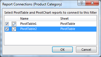
- Click the Report Connections button.
- Select the PivotTables that you want to connect the Slicer to and click Ok.
Creating a Calculated Field
You can create your own field in a PivotTable that performs calculations using the values of other fields in the PivotTable. These custom fields are known as calculated fields.
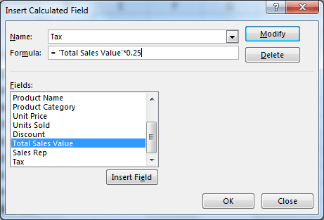
In this example, a calculated field has been used to find 25% of the sales total.
- Click on the Analyze tab of the Ribbon (Options in Excel 2007 and 2010).
- Click the Fields, Items and Sets button and select Calculated Field.
- Enter a Name for the field.
- Write the formula to perform the calculation. Double click a field from the list below to use it within the formula.
- Click Ok and the new field is created and added to the PivotTable.
Applying Conditional Formatting to PivotTables
Conditional Formatting is one of the best tools in Excel. And the great news is that it can be applied to values in a PivotTable.
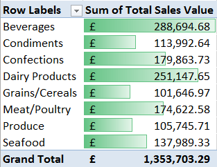
The steps below will apply data bars to the sales figures in the table. This will create a nice visual element for comparing the values.
- Highlight the values in the PivotTable.
- Click the Conditional Formatting button on the Home tab.
- Select Data Bars and then choose the Fill that you want to use.


Leave a Reply